What's new
AllBuffs | Unofficial fan site for the University of Colorado at Boulder Athletics programs

This is a sample guest message. Register a free account today to become a member! Once signed in, you'll be able to participate on this site by adding your own topics and posts, as well as connect with other members through your own private inbox!

  • Prime Time. Prime Time. Its a new era for Colorado football. Consider signing up for a club membership! For $20/year, you can get access to all the special features at Allbuffs, including club member only forums, dark mode, avatars and best of all no ads ! But seriously, please sign up so that we can pay the bills. No one earns money here, and we can use your $20 to keep this hellhole running. You can sign up for a club membership by navigating to your account in the upper right and clicking on "Account Upgrades". Make it happen!

Colorado is preseason No. 1

BuffSurveyor

Club Member
Club Member
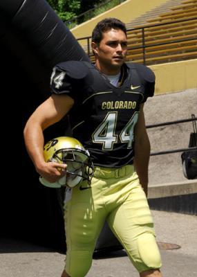
The Buffs apparently have the best looking uniforms in the 12-Pac. It's good to be No. 1 in the conference at something. Great way to make a statement joining a new conference.

If you can't win the games, I guess the next best thing is to look good loosing them. Until there is a Coaching change anyway.

http://bleacherreport.com/articles/413456-best-dressed-the-new-pac-12-uniform-power-rankings#page/1


Good Luck in the 12-Pac!

Best mascot too, don't forget that.
 
Best mascot too, don't forget that.

Hell, yea! I'm sorry I forgot to mention that!

BTW, How is the best Mascot doing these days? She hasn't gained weight or been driven to drinking during the off season, has she?

The Nations best Mascot needs to be in top shape for the Big 12 Conference farewell season tour and the following years 12-Pac welcome to the 12-Pack Conference tour.


Good Luck in the 12-Pac!
 
That will make a difference in recruiting.

It also drives a lot of national merchandising revenue when we're winning.
 
Our black pants and white jersey uniform is the best in college football, by far, IMO. Do we still use it?
 
I prefer the black jerseys, black pants, and gold helmets to the one cited in the article. However, CU's unis totally rock, no matter what combo they wear.
 
I like the black jerseys, black pants, and gold helmet home uni best. Looks badass!
 
When your 2nd or 3rd best uniform is still the best in the conference, that's pretty cool.

Colorado_display_image.jpg


Just wait until recruits see the 1990 throwbacks this season. That's going to kick some serious ass.

Orange903.jpg
 
I would give it to us for our 90s throwbacks but I like USC's more than our current unis. Wazzu #2, wtf?
 
BTW, How is the best Mascot doing these days? She hasn't gained weight or been driven to drinking during the off season, has she?

I think you're confused. Our mascot is not a fusker cheerleader, and therefore not generally prone to drunken obesity.

However, based on pictures I have seen of the UNL cheerleading squad, your mistake is completely understandable...
 
Agree -These were the best uniforms ever. I think the ones in the GB era were second best - simple but good. I liked the design ideas somebody posted here back in Feb or March which was basically the 90's uniform with a slightly italicized white Colorado text....was still big text like back in the day but the slight change kept it updated and fit with the italicized theme that the athletic dept uses. Not a huge fan of the new uniforms, mainly because of the ****ty gold color and I don't really like taking away the staple of the white text but honestly they still look great so no use really complaining. As long as our program doesn't go the Oregon route I'm okay with it.
 
Get rid of the italics and bring back the bold COLORADO!

I do hope eventually CU will go back to a bigger COLORADO on the front weather italics or not. Right now it kind of looks half-assed. The old style was more intimidating. Must have had some teams back in the day a little nervous when they lined up for the first play after kick off and saw a wall of huge dudes and COLORADO everywhere. When Alfred Williams running around everywhere I'm sure the QB's were like oh **** here comes god damned COLORADO again WTF!
 
That list lost any shred of credibility it may have had when it pegged WSU at #2. They should be about #10.
 
That list lost any shred of credibility it may have had when it pegged WSU at #2. They should be about #10.
I agree. I think Washington's should be higher, and Wazzu much lower.

So, CU has the best uniform, best live mascot, and the two-time defending national champion costumed mascot .... now all we need is a coach.
 
I could have gotten on board if they'd gone with Wazzou's away unis. I like the away silver.
 

whoa! snap, as they say on TV.

Mick's rankings:

1. CU of Barney/Mac years. 12. Neu/Hawk years.

1. USC
2. UCLA
3. UW
4. U of A with white helmet, not blue
5. Stanford (would be lower if they still had the black trim from the former Pitt coach era)
6. Cal's (though gheying it up highlight pen Oregon style of late)
7. ASU (the little devil guy is dumb)
8. Oregon (love em, hate em)
9. wazzou and OSU (just bad from the get go....aahhahahah an angry Beaver!).
10. running out of snappy one liners.
 
Last edited:
I could have gotten on board if they'd gone with Wazzou's away unis. I like the away silver.
I'm not a huge fan of the monotone look - jerseys and pants the same color. I think the contrast of a dark jersey with lighter pants looks much better.
 
I agree. I think Washington's should be higher, and Wazzu much lower.

So, CU has the best uniform, best live mascot, and the two-time defending national champion costumed mascot .... now all we need is a coach.

It appears we're getting the little things right.
 
wazzou's helmet logo looks like a 1st grade drawing contest winner.

I'm a fan of that design when it's on the away (red) helmet. The conference should do a throwback to 2001 when the new teams join so we can see Oregon and CU's unis the way they should have stayed since the Fiesta Bowl, without the silly updates.
 
I really like the black on black with the gold helmet as well, it makes our team look badass.
 
Yea, I don't how the hell they decided to put WSU at #2. I'm surprised UCLA isn't a little higher because it seems like people are always raving about their uniforms, although I never thought they were that great. I'd put USC at #2, but at least they got the obvious one right, which is Oregon at #12. :lol:
 
I did a WTF when I saw Wazzu at #2. Those unis look like Montana or some other 1-AA school. And they should be discredited for having a completely different color scheme on the road. How dumb.

I don't hate Oregon as much as everyone else, mainly because some of the combos they roll out are okay/good. They should just go back to the Joey Harrington era unis. Those were fine. I like Cal's bear-claw stripes... kinda unique.

Funny how CU got #1 when I think these are our worst unis in a long time. My favs were from the Barnett era with Chris Brown & Co.
 
Funny thing is I have never seen someone wearing an Oregon jersey around. They are just that bad! I know they're that bad because I have seen people wearing CSU jerseys and if they will stoop that low...
 
I would give it to us for our 90s throwbacks but I like USC's more than our current unis. Wazzu #2, wtf?

Totally agree with your take. SC looks dominate and should since their colors do exactly that. But CU's throwbacks to the 90s are so sweet. Recruits are going to love them. I hope they keep them.
 
Back
Top