Ok, that's fine. So do you ****ers seriously like our current uniforms? Do you like the faded yellow look that our gold pants resemble? Do you like that you can't even read the "COLORADO" on the front of the jerseys unless there is a close up of one player because the font is so small and cluttered with other colors? Do you like the additional designs, such as the line across the chest, the shoulder pad dealios, the weird geometry on the pants, etc., which are all unnecessary?
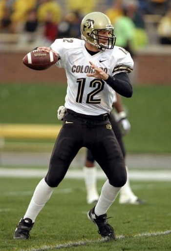
You're right, slider, we don't have uniform tradition. We have changed uniforms for our entire history. However, we did have excellent uniforms for about 10 years from mid 80s to mid 90s and then again during the Barnett era. Why were they so awesome? To begin with, they were bold. You could read the "COLORADO" from anywhere in the stadium and even if it was blurry, it was big and clear with contrast to the jersey (white on black or black on white). The numbers were big and clear along with the "COLORADO" so that when opposing players looked up they knew exactly who was coming to hit them and they remembered it long after. They didn't have any stupid ****ing geometric shapes that make the uniform look like a stupid ****ing coloring book. The gold colors were actually gold.
If you honestly like what we have now more than the uniforms from the early 90s or 00s, then you have something wrong with your eyes...and your opinion. How can you not love this: