What's new
AllBuffs | Unofficial fan site for the University of Colorado at Boulder Athletics programs

This is a sample guest message. Register a free account today to become a member! Once signed in, you'll be able to participate on this site by adding your own topics and posts, as well as connect with other members through your own private inbox!

  • Prime Time. Prime Time. Its a new era for Colorado football. Consider signing up for a club membership! For $20/year, you can get access to all the special features at Allbuffs, including club member only forums, dark mode, avatars and best of all no ads ! But seriously, please sign up so that we can pay the bills. No one earns money here, and we can use your $20 to keep this hellhole running. You can sign up for a club membership by navigating to your account in the upper right and clicking on "Account Upgrades". Make it happen!

2014 Official Uniform Thread

So who is in favor of CU getting a secondary logo? I'm sure a lot will say Ralphie is fine, but pretty much every other school has a 2nd logo. Cal and Georgia are a couple recent programs to add a secondary logo


We have a secondary logo.
CU-Logo.jpg

Colorado_Buffaloes_alternate_logo.gif
 
That logo sucks. And I haven't seen it used with any of our sports teams

That's because they're not permitted to use it. It's the system-wide academic logo (not Boulder specific). The academic side isn't permitted to use the athletic (ralphie) logo either.

It was part of President Benson's attempt to unify the system. It had quite the opposite effect.

Think about it. The AD represents the school (Boulder-specific), but they're not permitted to use same logo. I'd argue that move drove a wedge between the school and athletics. Boulder should have it's own logo, and it should be the same for both academics and athletics. One team!

Academic logo is different (Remember 700k was spent developing this one)

CU-Boulder-Logo.png
 
So tell me again why we are waiting for our new uniforms? Every team under the sun it seems is getting new ones, FSU, Syracuse again(just had new ones 2 seasons ago too), Illinois and on and on. yet we are waiting until next season? We have the best colors in the country, best logo and yet our jersey's are stuck in the 90's. Let's upgrade now, why wait? Is there a reason and I just missed it?
 
So tell me again why we are waiting for our new uniforms? Every team under the sun it seems is getting new ones, FSU, Syracuse again(just had new ones 2 seasons ago too), Illinois and on and on. yet we are waiting until next season? We have the best colors in the country, best logo and yet our jersey's are stuck in the 90's. Let's upgrade now, why wait? Is there a reason and I just missed it?

Retail stores need a year to get rid of the old product. We could have had new uniforms a few years ago but Embree declined.

Keep in mind the Hawkins uniforms we had were Nike test uniforms.
 
I actually didn't mind the Hawkins era uniforms. Would have changed some things, but for the most part I was a fan. Especially of the pants.
 
I actually didn't mind the Hawkins era uniforms. Would have changed some things, but for the most part I was a fan. Especially of the pants.

Yeah I never understood why so many hate them. If the golds matched they'd be great. I think a lot has to do with the Halk association.
 
Yeah I never understood why so many hate them. If the golds matched they'd be great. I think a lot has to do with the Halk association.

The gold had a weird green tint to it. Using the current gold would be fine though. Also the "silver" numbers did not look very good. They were hard to see at times on TV.

Some things cleaned up here and there and they would be alright. I think we can do better though.
 
The gold had a weird green tint to it. Using the current gold would be fine though. Also the "silver" numbers did not look very good. They were hard to see at times on TV.

Some things cleaned up here and there and they would be alright. I think we can do better though.

Agreed
 
There is nothing wrong with our uniforms, just our Won-Loss record. If we were winning hardware, kids would think our unis were great. I don't understand why people want to spin the wheel and see what abomination Nike or whoever wants to unveil, most of them are hideous, even the ones they put ample effort into. Nike doesn't care about CU (not like they used to), they are going to half-ass our new uniforms, and they're going to look like all of the rest: hideous.
 
UW getting new uni's tomorrow.

And Buffnut99, while it is hit or miss with Nike, we do need a change. If we were winning hardware you would be right, kids would love them. Problem is we haven't won anything in those uni's since 1994 when Salaam won his Heisman. The kids we are recruiting have never seen a successful CU football team in those uniforms. They associate them with losing, no matter how many games we won previously in them.

It is the new landscape of collegiate athletics. Unless your team is a traditional and current powerhouse then the uniforms become one more piece of the recruiting pitch. I think Oregon started a stupid trend by changing theirs every year, but no matter how stupid I or you or anyone thinks it is, we need an update.
 
Last edited:
UW getting new uni's tomorrow.

And Buffnut99, while it is hit or miss with Nike, we do need a change. If we were winning hardware you would be right, kids would love them. Problem is we haven't won anything in those uni's since 1994 when Salaam won his Heisman. The kids we are recruiting have never seen a successful CU football team in those uniforms. They associate them with losing, no matter how many games we won previously in them.

It is the new landscape of collegiate athletics. Unless your team is a traditional and current powerhouse then the uniforms become one more piece of the recruiting pitch. I think Oregon started a stupid trend by changing theirs every year, but no matter how stupid I or you or anyone thinks it is, we need an update.

Well said and I totally agree. It is time for something new and honestly with out color combination and our logo it is can't miss. Anything they do will look sharp, I think Nike does a great job in most cases. There are some bad ones but all in all I am a fan of the new designs.

On another topic. It will be interesting to see what UDub unveils tomorrow in the Petersen era, who still has not ruled on what he will do with C. Miles, yesterday he gave a huge non answer when asked point blank. I am going to their spring game Saturday, should be interesting.
 
The only reason fans have such a high attraction to our current uniforms is because of the period they symbolize. Nut, you can try and skate around it, but high schoolers now-a-days care about a thing called "swag" and our uniforms do not have it. Our uniform design is >20 years old, it's time to change and update. Nike cares about CU and RG isn't going to let them **** it up. Did they **** up **** Bailor's uniforms?

URL]


Nike makes a lot of quality clothing products in football.
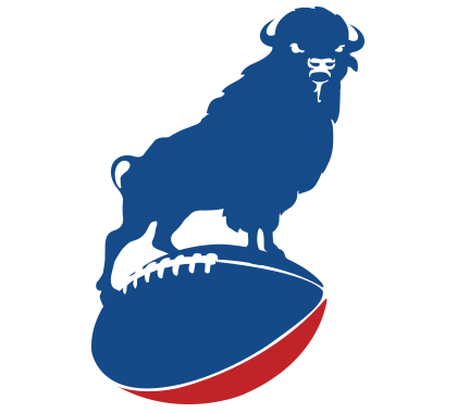
I hate the chrome gold, but given that the prototype for those Baylor uniforms was initially designed for us... I do like them.
 
even if it is just for a couple games a season, it spices things up. I imagine the most anti uni peeps wardrobe looking like the simpsons or something. same **** everyday.

I tried to find some good design stuff that we could work with but I don't like much of it.

http://www.footballasfootball.com/buffalo?s=b149

52e61a30-a37c-47f4-baee-460bd071cd2b
52526177-4448-4b5b-b445-4a26cdc4d1be


Something like this and connect the buffalo to native american roots? (too controversial?)
52a8d433-3f78-4357-950d-6d98d071cd2b


Ugh, but ultimately they all look pretty ****ty.
 
We need new unis now. The away unis we wore for the CSU game last year were horrible. Put me in the camp of those ready for a change.

piss yellow.jpg
 
Wait - i thought everyone loved those uni's and was clamoring for them... now they suck?
 
Wait - i thought everyone loved those uni's and was clamoring for them... now they suck?
I think everyone loved them because of what Embree tried to do here and that was take CU football back to that era. He failed.
 
Secondary logos don't help much from a branding perspective. I guess it's going that way now with schools picking them up, but in the 90's and early 2000s, schools were ditching them. For instance, Virginia only used the "V-Sabre" for football and used the "split V" for basketball (think Michigan's logo), they ditched the split-V and made all athletics the V-Sabre so recognition would increase.
 
Those uniforms are the only good thing Embree did. The constant tinkering and abomination uniforms came during the Hawkins tragedy. They can tinker with the uniforms for all I care, but please:

1) Leave the logo alone.
2) Do not go so crazy as to give us awful Oregon-style uniforms (like we had under Sqwaukins).


Sent from my iPad using Tapatalk
 
Get rid of our stripes on the sleeves. Makes them look dated. Also, if we want to wear white pants, can we get rid of the white pants from the Hawkins' years? We even look broke with mistmatched uniform designs.

Or just go back to the 2001 uniforms.

That's a start. Not against more changes, but they have to be better executed than those under the Hawkins era (No greenish/yellow helmets and pee pants).
 
Back
Top