What's new
AllBuffs | Unofficial fan site for the University of Colorado at Boulder Athletics programs

This is a sample guest message. Register a free account today to become a member! Once signed in, you'll be able to participate on this site by adding your own topics and posts, as well as connect with other members through your own private inbox!

  • Prime Time. Prime Time. Its a new era for Colorado football. Consider signing up for a club membership! For $20/year, you can get access to all the special features at Allbuffs, including club member only forums, dark mode, avatars and best of all no ads ! But seriously, please sign up so that we can pay the bills. No one earns money here, and we can use your $20 to keep this hellhole running. You can sign up for a club membership by navigating to your account in the upper right and clicking on "Account Upgrades". Make it happen!

New Uni's! The Hyper Elites

Shldr2Shldr

Club Member
Club Member
Bout damn time,

BSxsDZNCMAA7gqE.jpg:large


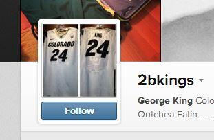
Names on the back, and some half tone CU stuff on the back. Also looks like we are keeping the all whites at home.
 
It was never that way when I was in school and Nike was the sponsor. I particularly hate that they slanted the CU inside the helmet logo.

The first time as far as I could find out in my quick research, was the Second Uni in the weasel's tenure. The uniform that had the silver stripes in the black numbers.
 
Very nice. The "slanted" letter trade dress has been around for fifteen-plus years. Time to get over it.
 
The old cu/ralphie logo looked like a something made on "Paint". The logo we got in '05 not only looks like a true logo(slick, powerful, and progressive) but also is a lot easier on the eye than the pre-'05 logo.
 
the only thing I don't like is how the fabric is stitched. It make it look like some iron-on CU decal on the back.
 
Hate slanted letters and numbers.

You probably hate rap music too.

I hate that we used to be the first to get special unis from NIKE and now we seem to be the last e.g.) Boulder Font Jerseys. Nike teams have had this style of jersey for years. :bang:
 
I am a traditionalist when it comes to this stuff (odd for my age of under 35!), but I love these. Quibble about fonts are minor, that Buff on the back is Badass.
 
The slant is our Nike Standard Font. Its on all of our stuff.

It's a Nike font named after our program. As a coach, I've ordered uniforms, and the font is titled "Boulder" if I remember correctly.

Edit: Sorry, shldr beat me to it. Anyway, I like the font.
 
SLANTED COMIC SANS


Not at all similar. I get that you don't like it, and it probably wasn't that way when you attended, but it has been that way for almost 15 years now.
 
Last edited:
These unis are great, and to complain about font (slantness) is crazy do we have a strong enduring tradition with any of our uniforms?. I like that all of our teams are willing to adapt to the times! For the older folk didn't Bob Dylan teach you that the times they are a changin'.
 
It's a Nike font named after our program. As a coach, I've ordered uniforms, and the font is titled "Boulder" if I remember correctly.

Edit: Sorry, shldr beat me to it. Anyway, I like the font.

That's actually not true. The font is "ITC Machine w/ 9 degree slant"
 
Back
Top