
AllBuffs | Unofficial fan site for the University of Colorado at Boulder Athletics programs
-
Prime Time. Prime Time. Its a new era for Colorado football. Consider signing up for a club membership! For $20/year, you can get access to all the special features at Allbuffs, including club member only forums, dark mode, avatars and best of all no ads ! But seriously, please sign up so that we can pay the bills. No one earns money here, and we can use your $20 to keep this hellhole running. You can sign up for a club membership by navigating to your account in the upper right and clicking on "Account Upgrades". Make it happen!
You are using an out of date browser. It may not display this or other websites correctly.
You should upgrade or use an alternative browser.
You should upgrade or use an alternative browser.
Uniform Prediction Thread - 2018 Game 4 - UCLA (Home)
- Thread starter Tatanka™
- Start date
BerkeleyBuff
Well-Known Member
Actually, they use the same stickers with all helmets. The gold outline and "CU" just blend together seamlessly with the gold helmets. They could solve this easily if they wanted to by using different stickers with each helmet. I think it probably would look better. They've obviously decided that they prefer using one consistent sticker with the official logo coloring.
You can clearly see it's the same sticker in this tweet.
Nah, you can clearly see it’s not. That gold CU is nice and metallic; it literally is the helmet color shining through. The alternate helmets have a dull gold CU and outline, because it’s not the same.

BerkeleyBuff
Well-Known Member
Edited/ double post because internet in Ecuador is shifty
I don’t know who’s correct, but just want to point out that different cameras, filters and lighting will make the same color look completely different. The glossy shine looks the same.View attachment 27452
Nah, you can clearly see it’s not. That gold CU is nice and metallic; it literally is the helmet color shining through. The alternate helmets have a dull gold CU and outline, because it’s not the same.
View attachment 27452 View attachment 27452
Actually, they use the same stickers with all helmets. The gold outline and "CU" just blend together seamlessly with the gold helmets. They could solve this easily if they wanted to by using different stickers with each helmet. I think it probably would look better. They've obviously decided that they prefer using one consistent sticker with the official logo coloring.
You can clearly see it's the same sticker in this tweet.
Berkeley is correct in this exchange - it is totally obvious. I've made similar requests in the past: just reverse the logo and make it similarly transparent. How is this so hard?View attachment 27452
Nah, you can clearly see it’s not. That gold CU is nice and metallic; it literally is the helmet color shining through. The alternate helmets have a dull gold CU and outline, because it’s not the same.
View attachment 27452 View attachment 27452
I think I have the answer: It isn't hard. They could snap their fingers and do this. They aren't doing it, because they paid millions of dollars a few years ago for a marketing company to tell them their brand was fractured because there were way too many versions of the CU Buffs symbol. They standardized on one that leaned forward slightly compared to the previous one we associated with most frequently.
Rightly or wrongly, no one is going to vary from that multi-million $$ investment in marketing consulting a few years back until senior leadership turns over.
My opinion doesn't matter, this is the root of it.
Last edited:
BerkeleyBuff
Well-Known Member
After looking at those two pictures more, it's even easier to tell - on the gold helmets, the transparent outline to the buffalo is quite thin, whereas on the black helmet the gold sticker outline is quite thick.Nah, you can clearly see it’s not. That gold CU is nice and metallic; it literally is the helmet color shining through. The alternate helmets have a dull gold CU and outline, because it’s not the same.
View attachment 27452
It’s yucky.After looking at those two pictures more, it's even easier to tell - on the gold helmets, the transparent outline to the buffalo is quite thin, whereas on the black helmet the gold sticker outline is quite thick.
Hmmm. Certainly looks like you are correct based on that photo.Nah, you can clearly see it’s not. That gold CU is nice and metallic; it literally is the helmet color shining through. The alternate helmets have a dull gold CU and outline, because it’s not the same.
View attachment 27452
Berkeley is correct in this exchange - it is totally obvious. I've made similar requests in the past: just reverse the logo and make it similarly transparent. How is this so hard?
I think I have the answer: It isn't hard. They could snap their fingers and do this. They aren't doing it, because they paid millions of dollars a few years ago for a marketing company to tell them their brand was fractured because there were way too many versions of the CU Buffs symbol. They standardized on one that leaned forward slightly compared to the previous one we associated with most frequently.
Rightly or wrongly, no one is going to vary from that multi-million $$ investment in marketing consulting a few years back until senior leadership turns over.
My opinion doesn't matter, this is the root of it.
**** your reasoning this **** out.
I want freakin' silver helmets with freakin' black buffaloes on them!

That would be better than that silver helmet with the horns.**** your reasoning this **** out.
I want freakin' silver helmets with freakin' black buffaloes on them!
That would be better than that silver helmet with the horns.
I actually liked the throwback helmets with the horns. Now, the piss yellow jerseys they wore with them.....
Those are awful!
Yeah, the helmets weren't God Awful I suppose, just wasn't a fan of them. The jerseys, umm yeah, not too attractive.I actually liked the throwback helmets with the horns. Now, the piss yellow jerseys they wore with them.....
Yeah, the helmets weren't God Awful I suppose, just wasn't a fan of them. The jerseys, umm yeah, not too attractive.
Looking at them again, they weren't great, lol.
nostalgicFor those of you who are having trouble remembering the buffalo horns on the silver helmets (apparently our take on Michigan's Wolverine helmet or various teams' Ram helmet) along with the horrific yellow jerseys, here ya go:
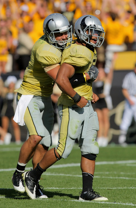
Such a great win over Wyoming that day!
The horns are ****ed up though, kinda looks like a Brachiosaur.
I don't care when @DBT first joined AARP there's no excuse for those helmets1960's
Interesting - I love history
https://static.cubuffs.com/custompages/football/2016_Info_Guide/543-544_logo_uniform.pdf
https://static.cubuffs.com/custompages/football/2016_Info_Guide/543-544_logo_uniform.pdf
Looks like we had the swoosh before Nike did.1960's
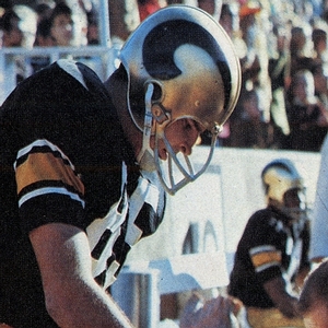
Still awful - I don't care how nostalgic.
DBT is Moses, I don't think AARP was a thing yet.I don't care when @DBT first joined AARP there's no excuse for those helmets
darth-horax
Well-Known Member
bbb or gbg
Deleted member 807
Guest
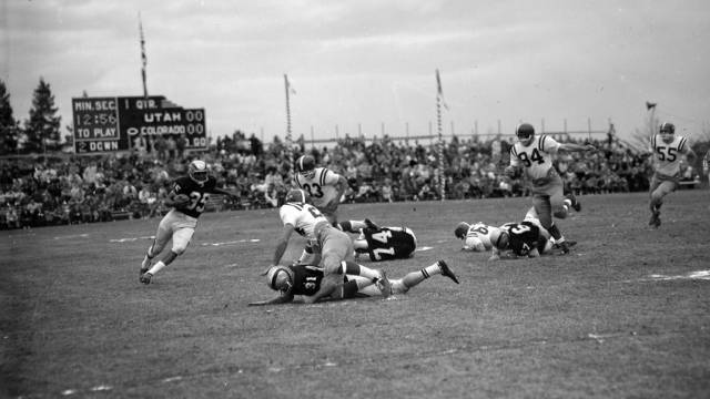
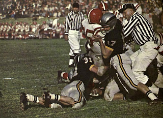
1960's
1956 / 1957 Orange Bowl was the inspiration for CU’s throwback helmet used in 2009 vs Wyo.
http://www.helmethut.com/College/Colorado/UC5656A.html
It’s almost like the equipment/helmet design people forgot they were supposed to do something until game day.For those of you who are having trouble remembering the buffalo horns on the silver helmets (apparently our take on Michigan's Wolverine helmet or various teams' Ram helmet) along with the horrific yellow jerseys, here ya go: