
I was there.
I was at my best friends birthday party... watching the game instead. it was glorious!
I was there.

10 Days until new unis
fifyThis QB sets the bar for the new one to beat.
The mismatching gold was flat out turrible.
View attachment 16191View attachment 16192View attachment 16193View attachment 16194
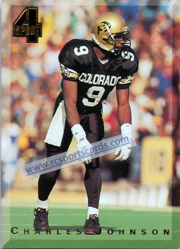
The man who started it all.


Dude really punted that **** into the stands, didn't he?
He just re-did the logo but took out the flatirons. I didn't even know they were the flatirons until you pointed it out and now I cannot un-see it. Well, unless I look at that dudes updated logo.
He took out the Flatirons and "updated" the logo to mimic a 50's era Disney cartoon.
Chill out it looks great
Hannibal NaviesWho is that?
He just re-did the logo but took out the flatirons. I didn't even know they were the flatirons until you pointed it out and now I cannot un-see it. Well, unless I look at that dudes updated logo.
I can't tell if you're being sarcastic here, but if not, you are certainly welcome to your own opinions and tastes.
Obviously, I think the updated version looks cartoony, and I think that by eliminating the Flatirons imagery, it somewhat misses the point. But that's merely my opinion.
Was that the Matrix?
Evident in the post by Dply, if you didn't know the flatirons were there then it is easily missed and I would bet most people don't even know its there.
I can't tell if you're being sarcastic here, but if not, you are certainly welcome to your own opinions and tastes.
Obviously, I think the updated version looks cartoony, and I think that by eliminating the Flatirons imagery, it somewhat misses the point. But that's merely my opinion.


